Travel with TataNeu
Travel with TataNeu
We created TataNeu's Next-Gen Travel Booking, seamlessly integrating Data's renowned legacy with innovative design. With millions of users, our design ethos redefines travel experiences. Delight in seamless journeys and loyalty rewards, and creating the first travel experience within Tata Neu’s larger ecosystem of super app.
We created TataNeu's Next-Gen Travel Booking, seamlessly integrating Data's renowned legacy with innovative design. With millions of users, our design ethos redefines travel experiences. Delight in seamless journeys and loyalty rewards, and creating the first travel experience within Tata Neu’s larger ecosystem of super app.
Aviation
Aviation
Mobile
Mobile
New Build
New Build
14
14
14
Months
I contributed to TataNeu's End-to-End flight booking experience and integrated designs for 35M* NeuPass rewards members while
aiding Product development.
I contributed to TataNeu's End-to-End flight booking experience and integrated designs for 35M* NeuPass rewards members while
aiding Product development.
I contributed to TataNeu's End-to-End flight booking experience and integrated designs for 35M* NeuPass rewards members while
aiding Product development.
*Sources: www.Moneycontrol.com
MY ROLE
UX Analysis: I conducted research, ideated features, crafted personas, and designed user flows and wireframes for deployment.
UI Design: I created the visual journey for the entire post-booking flow, and flight search results, and integrated dark/white themes seamlessly. I created illustrations and empty states.
Production Support: I provided continuous support during production, implementing features, managing assets, and ensuring timely delivery by collaborating closely with client design managers.
RESULTS
Our efforts led to the successful launch of the inaugural Tata Neu travel and hotel booking experience, marking a significant enhancement to the Super App's travel business wing and consequently, the broader TATA group.
Our visual design work strengthened Tata Neu's overall design ecosystem, ensuring a seamless experience for users.
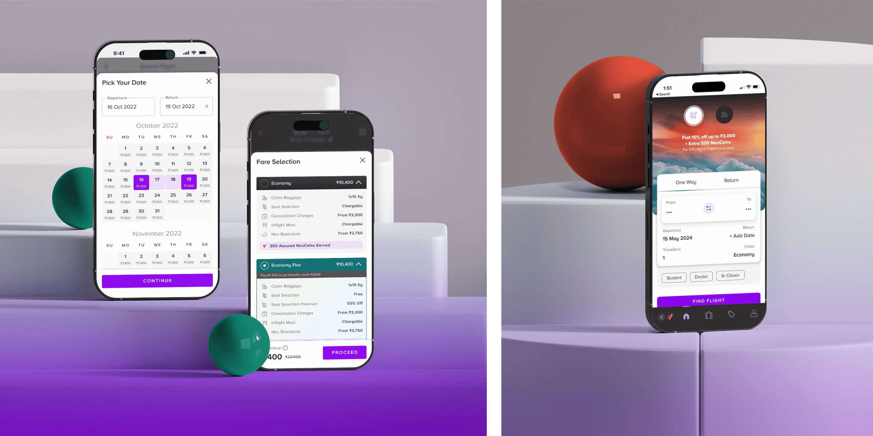
We introduced novel travel experiences such as the New Calendar system of booking, EMI travel plans, and the integration of flight and hotel grouping, alongside curating unique, personalized travel and tour packages tailored to diverse user needs.
Our efforts led to the successful launch of the inaugural Tata Neu travel and hotel booking experience, marking a significant enhancement to the Super App's travel business wing and consequently, the broader
TATA group.
Our visual design work strengthened Tata Neu's overall design ecosystem, ensuring a seamless experience for users.
We introduced novel travel experiences such as the New Calendar system of booking, EMI travel plans, and the integration of flight and hotel grouping, alongside curating unique, personalized travel and tour packages tailored to diverse user needs.
RESULTS
Our efforts led to the successful launch of the inaugural Tata Neu travel and hotel booking experience, marking a significant enhancement to the Super App's travel business wing and consequently, the broader TATA group.
Our visual design work strengthened Tata Neu's overall design ecosystem, ensuring a seamless experience for users.
We introduced novel travel experiences such as the New Calendar system of booking, EMI travel plans, and the integration of flight and hotel grouping, alongside curating unique, personalized travel and tour packages tailored to diverse user needs.
PROJECT COLLABORATORS
Our Team : 2 Product Designers(Flight),1 Product Manager, 1 Junior UI/UX Designer, 1 Design Intern, 1 Design Head
Our Team : 2 Product Designers(Flight),1 Product Manager, 1 Junior UI/UX Designer, 1 Design Intern, 1 Design Head
TataNeu(Client) Team : 2 Product Designers,
1 Product Manager, 1 Design Head of Tata Group, 1 Product Head, 1 Strategic UX Designer & the Development Team.
TataNeu(Client) Team : 2 Product Designers,
1 Product Manager, 1 Design Head of Tata Group, 1 Product Head, 1 Strategic UX Designer & the Development Team.

NEUCoinS BUSINESS STRATEGY
NEUCoinS BUSINESS
STRATEGY
Seamlessly integrate Tata Neu's loyalty programs into building unique travel booking experience, enhancing the unified Eco-System of the Super App.
Seamlessly integrate Tata Neu's loyalty programs into building unique travel booking experience, enhancing the unified Eco-System of the Super App.
Seamlessly integrate Tata Neu's loyalty programs into building unique travel booking experience, enhancing the unified Eco-System of the Super App.
The Tata Neu Pass loyalty program stands as a unique selling proposition, seamlessly serving multiple business chains within the Tata Group.
Platforms: iOS, Android, Web
The Tata Neu Pass loyalty program stands as a unique selling proposition, seamlessly serving multiple business chains within the Tata Group.
Platforms: iOS, Android, Web
The Tata Neu Pass loyalty program stands as a unique selling proposition, seamlessly serving multiple business chains within the Tata Group.
Platforms: iOS, Android, Web


HOW WE SOLVED
To begin, we collaborated with the entire internal design team to grasp the essence of travel in India. We created image boards and identified keywords that resonated with each team members perspective in a brainstorm jam session, kickstarting the project.
To begin, we collaborated with the entire internal design team to grasp the essence of travel in India. We created image boards and identified keywords that resonated with each team members perspective in a brainstorm jam session, kickstarting the project.
To begin, we collaborated with the entire internal design team to grasp the essence of travel in India. We created image boards and identified keywords that resonated with each team members perspective in a brainstorm jam session, kickstarting the project.
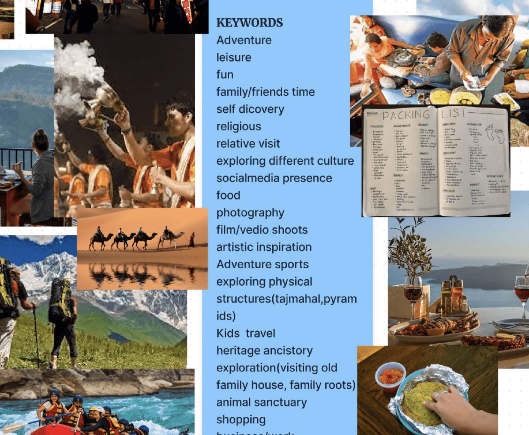


We brainstormed travel ideas through images and identify impactful keywords that capture the essence of travel.
We brainstormed travel ideas through images and identify impactful keywords that capture the essence of travel.
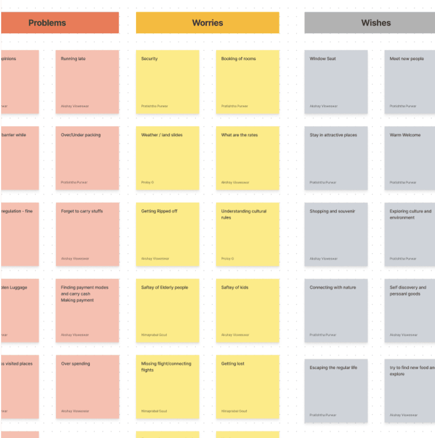


We identified, categorized, and listed the major user problems, worries, wishes, and needs.
We identified, categorized, and listed the major user problems, worries, wishes, and needs.
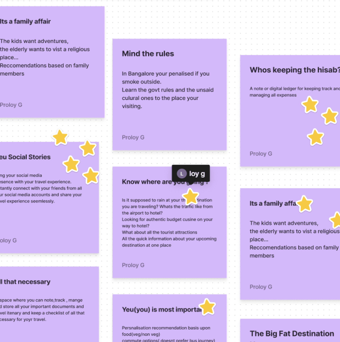


We collaborated to develop new features and solutions by analyzing needs and problems then voted on the best ideas.
We collaborated to develop new features and solutions by analyzing needs and problems then voted on the best ideas.
THE INITIAL PRESENTATION
THE INITIAL
PRESENTATION
We crafted three themes reflecting Tata's ethos and legacy
1. Plan your Travel Neu way: budget, friends, and bucket list seamlessly catered for your travel needs.
2. Celebrate travel like a festival: In India, festivals are integral. We reward ourselves, making travel rewarding.
3.Neu social stories: Share travel stories with your Social Network, celebrating your inner explorer.
1. Plan your Travel Neu way: Budget, friends, and bucket list seamlessly catered for your travel needs.
2. Celebrate travel like a festival: In India, festivals are integral. We reward ourselves, making travel rewarding.
3.Neu social stories: Share travel stories with your Social Network, celebrating your inner explorer.
1. Plan your Travel Neu way: budget, friends, and bucket list seamlessly catered for your travel needs.
2. Celebrate travel like a festival: In India, festivals are integral. We reward ourselves, making travel rewarding.
3.Neu social stories: Share travel stories with your Social Network, celebrating your inner explorer.
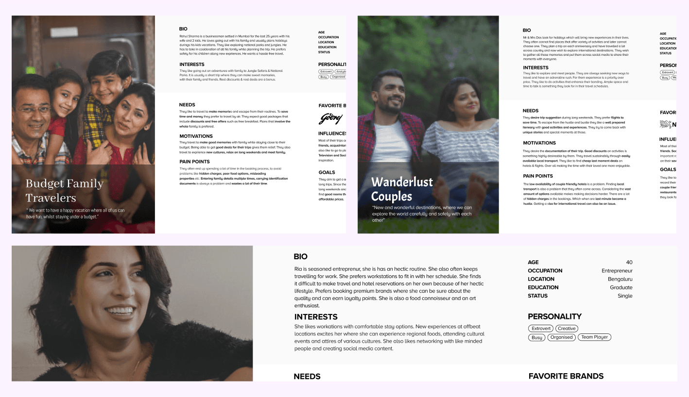
USER PERSONA
1. Budget Family Travelers
2. Wanderlust Couples
3. Luxury Retreat
1. Budget Family Travelers
2. Wanderlust Couples
3. Luxury Retreat
USER PERSONA
1. Budget Family Travelers
2. Wanderlust Couples
3. Luxury Retreat


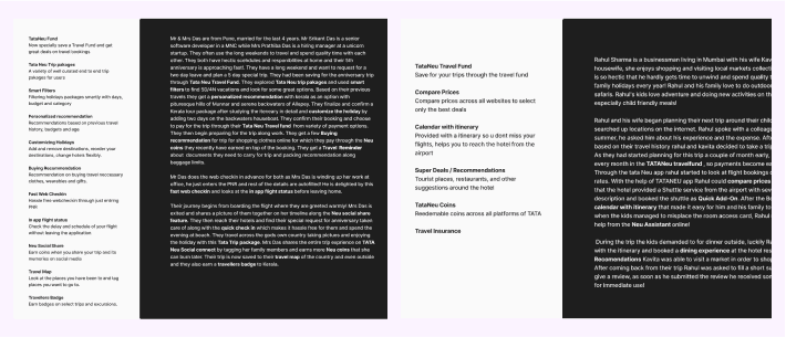
USER SCENARIO
We crafted multiple user scenarios
from defined personas.
We crafted multiple user
scenarios from defined personas.
USER SCENARIO
We crafted multiple user scenarios
from defined personas.


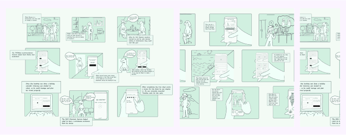
Story board
We also developed storyboards to
visualize and refine the user experience.
We also developed storyboards
to visualize and refine the
user experience.
Story board
We also developed storyboards to
visualize and refine the
user experience.


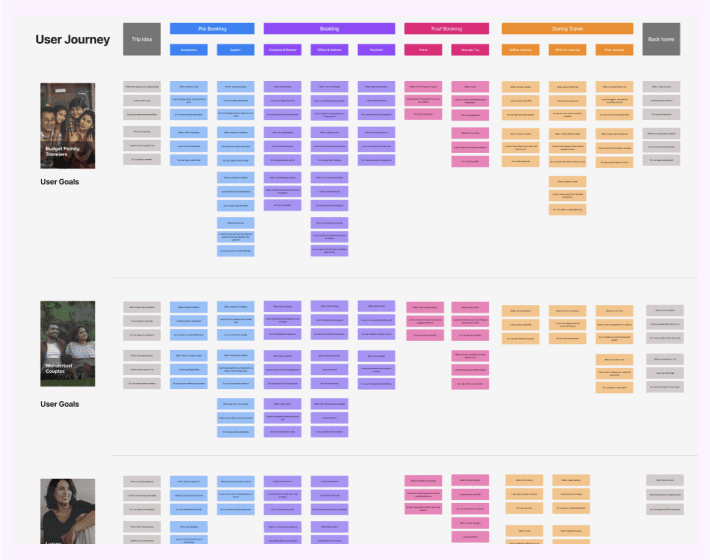
Information Cluster
We structured the user journey and information architecture into Primary phases—Precooking, Booking, Post-Booking, and While
Travelling for further clarity.
We structured the user journey and information architecture into Primary phases—Precooking, Booking, Post-Booking, and While Travelling for further clarity.
Information Cluster
We structured the user journey and information architecture into Primary phases - Prebooking, Booking, Post-Booking, and While Travelling for further clarity.


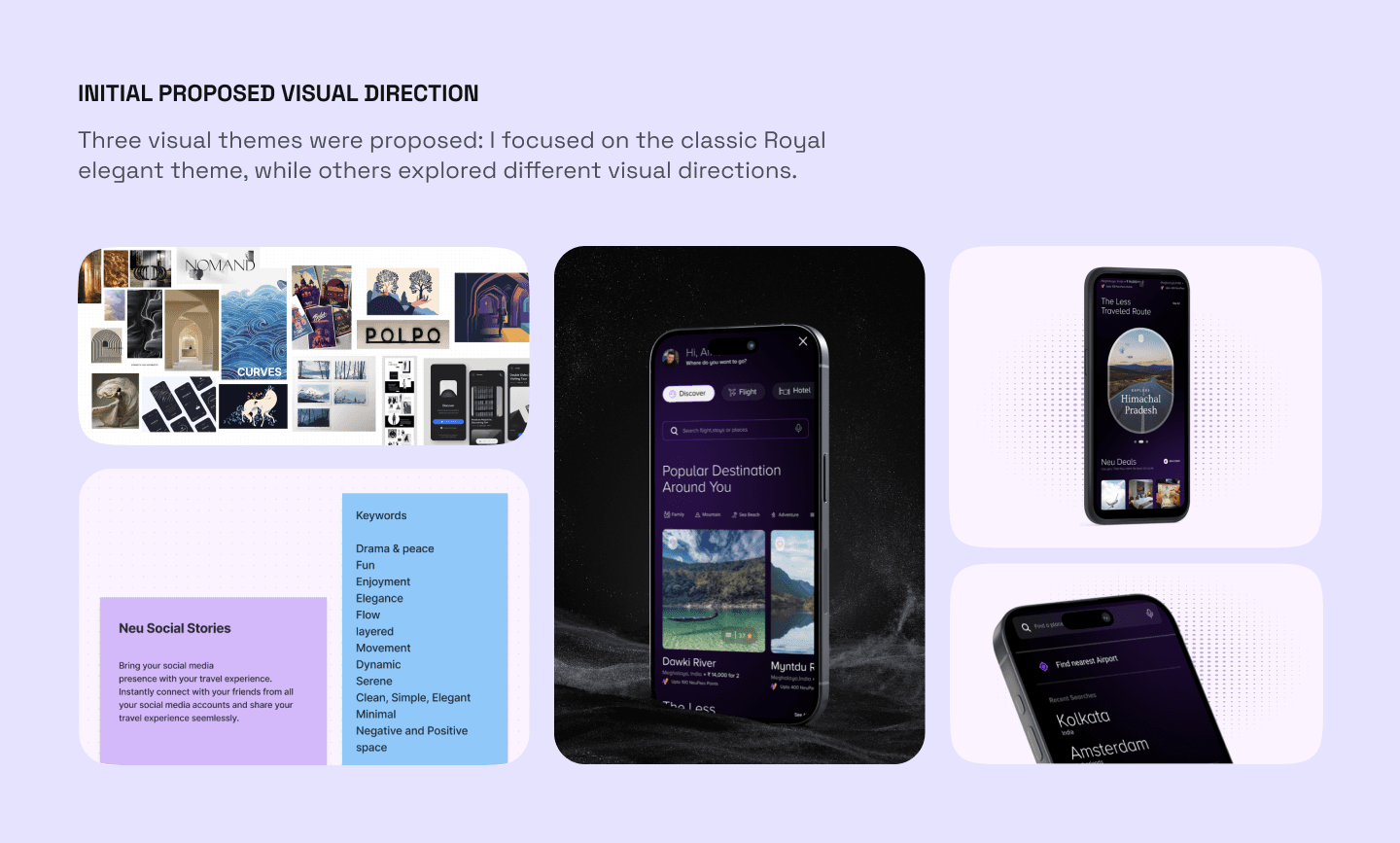

First Reaction
Initial feedback from clients was overwhelmingly positive, impressed by all visual directions. Next, we decided on the strategic action plan.
We divided the project into three phases and crafted the timeline accordingly.
Initial feedback from clients was overwhelmingly positive, impressed by all visual directions. Next, we decided on the strategic
action plan.
We divided the project into three phases and crafted the timeline accordingly.
Initial feedback from clients was overwhelmingly positive, impressed by all visual directions. Next, we decided on the strategic
action plan.
We divided the project into three phases and crafted the timeline accordingly.
Phase
01
DEEPER RESEARCH
We continued extensive research. This included analyzing market reports, understanding diverse Indian customer segments, and collaborating with TAA researchers. We held workshops to brainstorm, debate, and refine insights on user behaviour, needs, and requirements.
We continued extensive research. This included analyzing market reports,
understanding diverse Indian customer segments, and collaborating with TAA researchers. We held workshops to brainstorm, debate, and refine insights on user behaviour, needs, and requirements.
We continued extensive research. This included analyzing market reports, understanding diverse Indian customer segments, and collaborating with TAA researchers. We held workshops to brainstorm, debate, and refine insights on user behaviour, needs, and requirements.
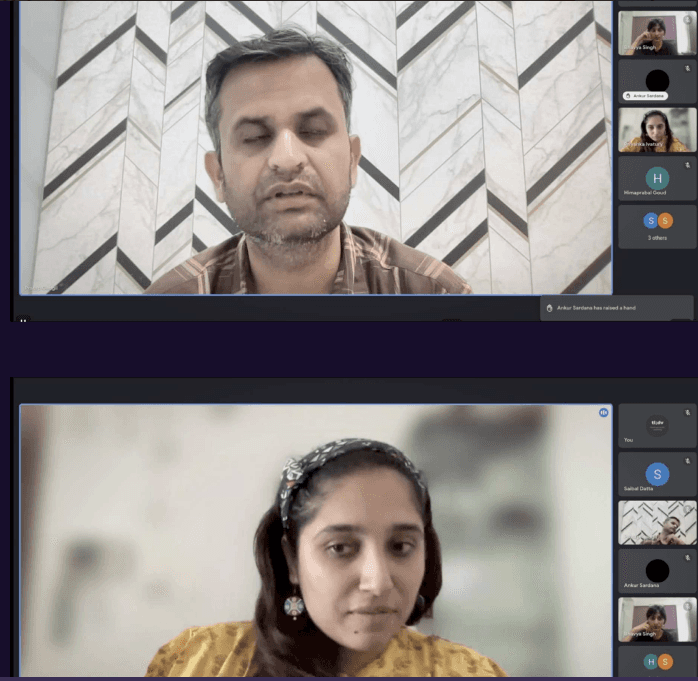


User Interviews: To gain even deeper user insights, we collaborated with Tata research teams.
We participated in user interviews, getting first hand information about the needs and challenges faced by Indian travelers.
User Interviews: To gain even deeper user insights, we collaborated with Tata research teams.
We participated in user interviews, getting first hand information about the needs and challenges faced by Indian travelers.
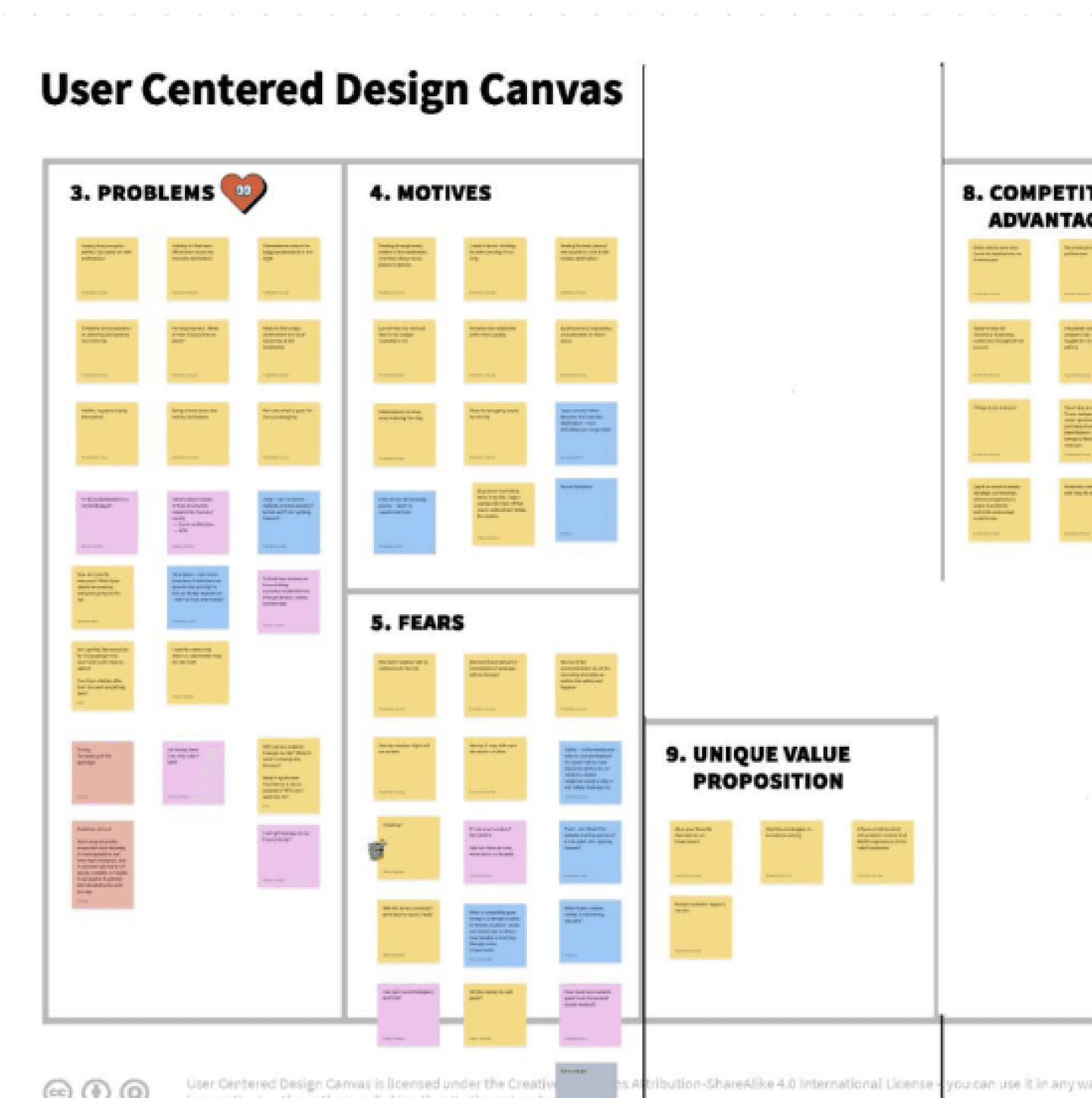


Mapping User Needs: We used a collaborative tool called the UCD Canvas to define user goals, problems, and needs in detail.
This helped us focus on what really matters to travellers.
Mapping User Needs: We used a collaborative tool called the UCD Canvas to define user goals, problems, and needs in detail.
This helped us focus on what really matters to travellers.
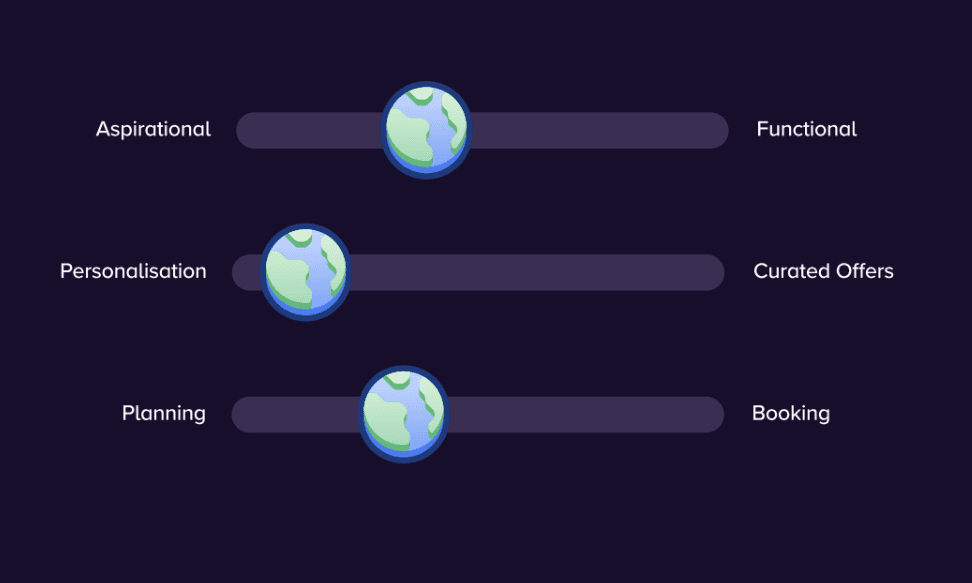


Product Personality: We explored various keywords (energetic, approachable, etc.) to understand the desired user experience. Through discussions and voting, we narrowed down the ideal tone.
Product Personality: We explored various keywords (energetic, approachable, etc.) to understand the desired user experience. Through discussions and voting, we narrowed down the ideal tone.
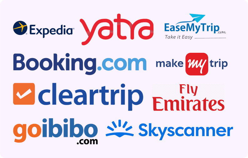
Competitive RESEARCH
We checked tons of flight booking
apps to see how people book.
We evaluated negative, positive,
No. Of app clicks, personality, special
features and documented them.
We checked tons of flight booking apps to see how people book. We evaluated negative, positive, No. Of app clicks, personality, special
features and documented them.
Competitive RESEARCH
We checked tons of flight booking
apps to see how people book.
We evaluated negative, positive,
No. Of app clicks, personality, special
features and documented them.


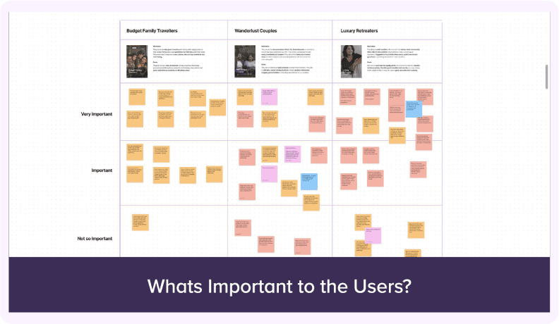
Understanding User
Based on user personas and backed by
interview data, the team categorized user
goals by importance. This helped us identify
the essential features needed for the MVP.
Based on user personas and backed by interview data, the team categorized user
goals by importance. This helped us identify the essential features needed for the MVP.
Understanding User
Based on user personas and backed by
interview data, the team categorized user
goals by importance. This helped us identify
the essential features needed for the MVP.


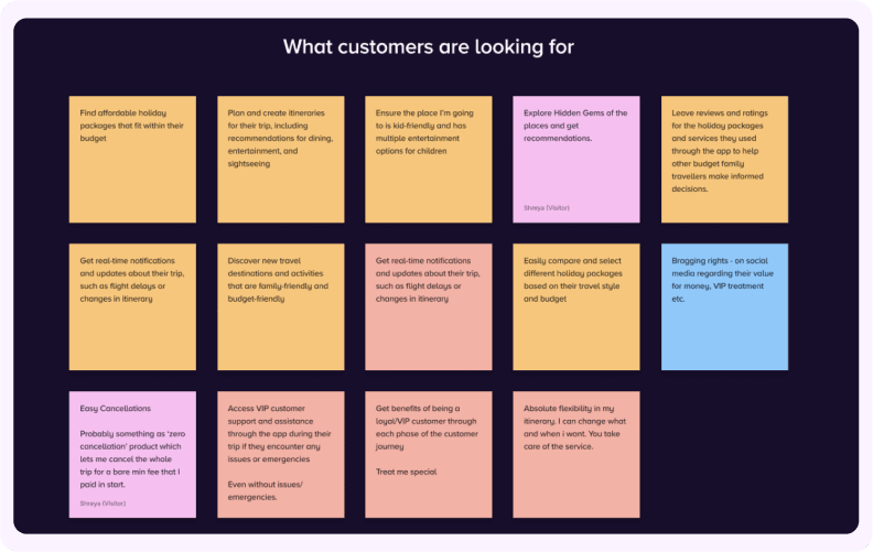
User Goals
Using interview data, user research, and
our subject expertise, we pinpointed
what users are truly looking for.
Using interview data, user research, andour subject expertise, we pinpointed what users are truly looking for.
User Goals
Using interview data, user research, and
our subject expertise, we pinpointed what users are truly looking for.


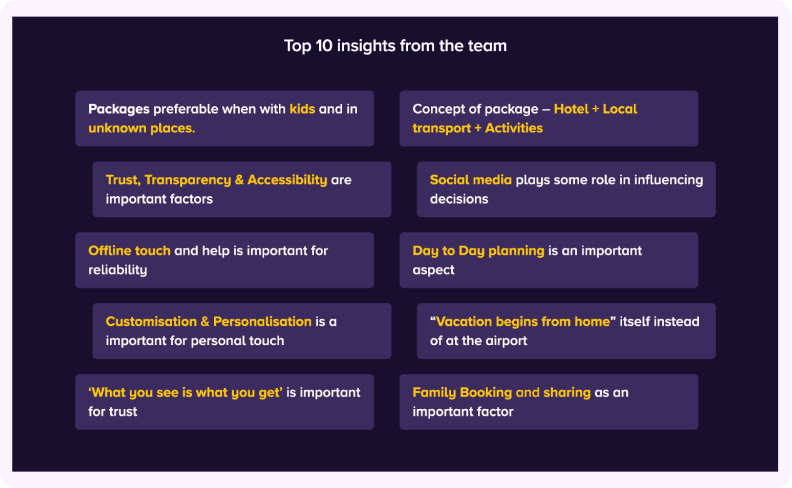
KEY USER INSIGHTS
These insights from user interview and
research highlight key needs and
preferences, guiding our user-centered
design approach.
These insights from user interview and research highlight key needs and preferences, guiding our user-centered design approach.
KEY USER INSIGHTS
These insights from user interview and
research highlight key needs and
preferences, guiding our user-centered
design approach.


Insights into Solutions:
After analyzing user research, we identified key pain points. We then collaborated to brainstorm innovative solutions & unique features.
This user-centered approach ensured our designs addressed the problems we uncovered, creating a Better user
experience.
Some new Concept:
After analyzing user research, we identified key pain points. We then collaborated to brainstorm innovative solutions & unique features.
This user-centered approach ensured our designs addressed the problems we uncovered, creating a Better user experience.
Some new Concept:
After analyzing user research, we identified key pain points. We then collaborated to brainstorm innovative solutions & unique features.
This user-centered approach ensured our designs addressed the problems we uncovered, creating a Better user
experience.
Some new Concept:
Neu Calendar
The Neu Calendar helps you find better deals for important events.
It serves as history also
The Neu Calendar helps you find better deals for important events.
It serves as history also
The Neu Calendar helps you find better deals for important events.
It serves as history also
Talk to an Expert
Talk to an
Expert
Talk to an Expert whenever you face a problem.
Talk to an Expert whenever you face a problem.
Talk to an Expert whenever you face a problem.
Location Reels
Location
Reels
Get inspired by scenic video reels and augmented experience
Get inspired by scenic video reels and augmented experience
Get inspired by scenic video reels and augmented experience
EMI Payments
What does it do: Book your dream trip and pay over time with EMIs
What does it do: Book your dream trip and pay over time with EMIs
What does it do: Book your dream trip and pay over time with EMIs
Holiday Map
What does it do: A map where the users can click and discover activities.
What does it do: A map where the users can click and discover activities.
What does it do: A map where the users can click and discover activities.
Memory Magnets
Memory
Magnets
What does it do: A gamified experience to encourage you to travel....and MORE
What does it do: A gamified experience to encourage you to travel....and MORE
What does it do: A gamified experience to encourage you to travel....and MORE
Phase
02
STRUCTURE AND SKELETON
Next, we created wireframes and the information architecture. I worked closely with the client’s project manager, regularly discussing and refining the flow. I presented multiple solutions for each issue, and we chose the best one based on data
and research.
Next, we created wireframes and the information architecture. I worked closely with the client’s project manager, regularly discussing and refining the flow. I presented multiple solutions for each issue, and we chose the best one based on data
and research.
Next, we created wireframes and the information architecture. I worked closely with the client’s project manager, regularly discussing and refining the flow. I presented multiple solutions for each issue, and we chose the best one based on data
and research.
User Flow AND
Information Architecture
User Flow AND
Information
Architecture
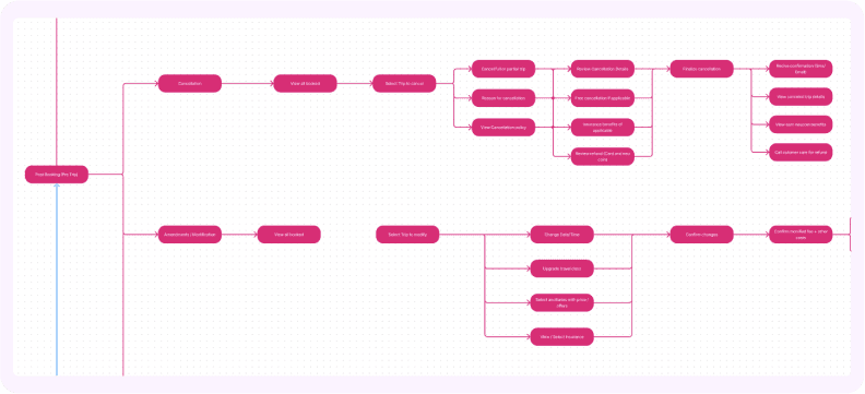
We developed the architecture and user flow to gain visual clarity and facilitate discussions, ensuring the entire team stayed on the same page
We developed the architecture and user flow to gain visual clarity and facilitate discussions, ensuring the entire team stayed on the same page
User Flow AND
Information
Architecture
We developed the architecture and user flow to gain visual clarity and facilitate
discussions, ensuring the entire team stayed on the same page


Wireframing
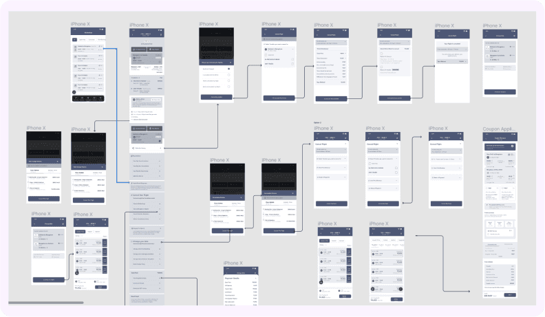
We started by mapping out the entire happy flow of the experience, divided into booking and post-booking phases. It took us around three weeks to complete this stage. We worked quickly to move on to the visual design phase and get things rolling.
We started by mapping out the entire happy flow of the experience, divided into booking and post-booking phases. It took us around three weeks to complete this stage. We worked quickly to move on to the visual design phase and get things rolling.
Wireframing
We started by mapping out the entire happy flow of the experience, divided into booking and post-booking phases. It took us around three weeks to complete this stage. We worked quickly to move on to the visual design phase and get things rolling.


Phase
03
VISUAL APPROACH
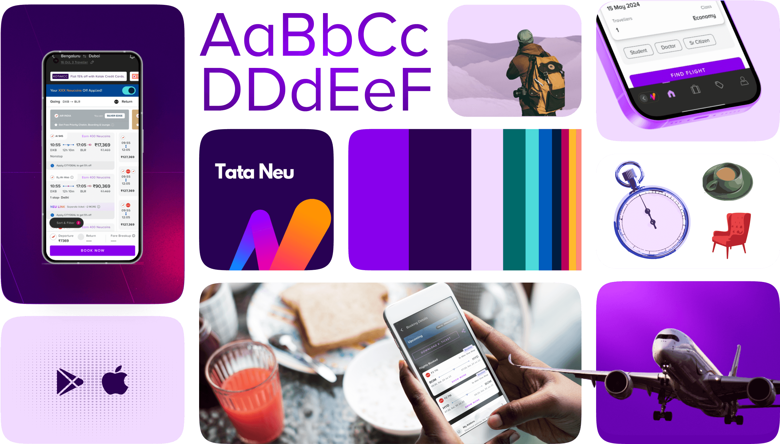
We followed the Tata Digital's design system, using their defined fonts, colors, and icons for our travel experience. Despite the constraints, it was fun to work within boundaries and create a cohesive visual design that fits seamlessly into the larger ecosystem.
We followed the Tata Digital's design system, using their defined fonts, colors, and icons for our travel experience. Despite the constraints, it was fun to work within boundaries and create a cohesive visual design that fits seamlessly into the larger ecosystem.
We followed the Tata Digital's design system, using their defined fonts, colors, and icons for our travel experience. Despite the constraints, it was fun to work within boundaries and create a cohesive visual design that fits seamlessly into the larger ecosystem.
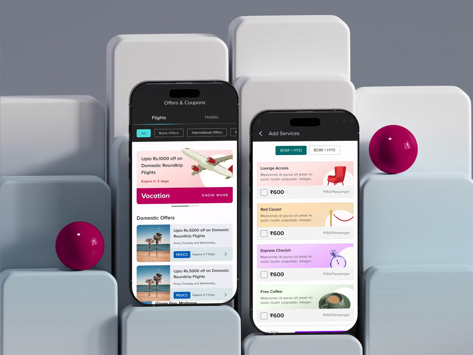
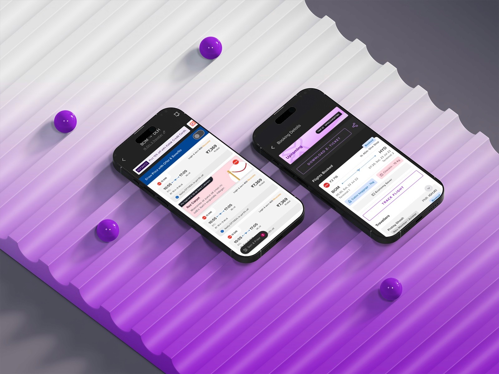
During design, we enriched the existing system with new micro animations, colors, icons, and illustrations. We combined dark and white themes to meet
design needs.
During design, we enriched the existing system with new micro animations, colors, icons, and illustrations. We combined dark and white themes to meet
design needs.
During design, we enriched the existing system with new micro animations, colors, icons, and illustrations. We combined dark and white themes to meet
design needs.

FLIGHT LISTING Conundrum:
FLIGHT LISTING Conundrum:
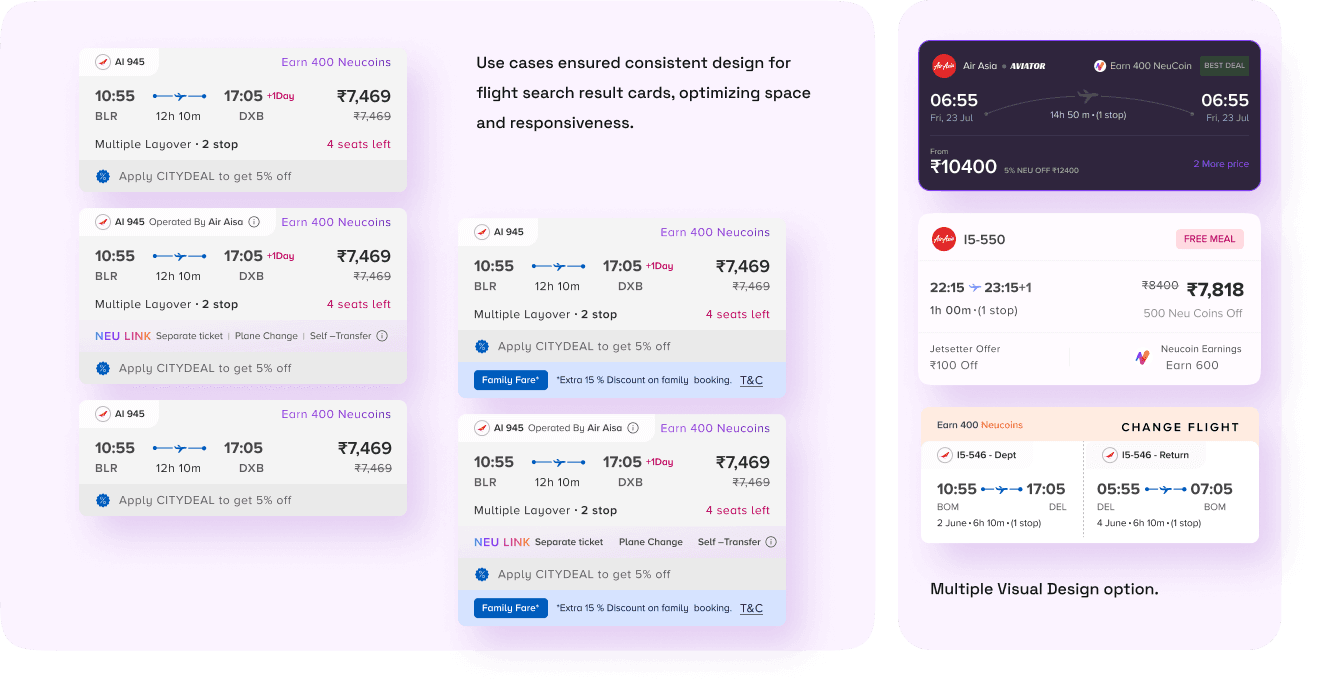
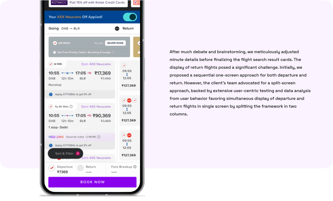
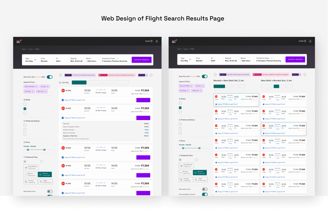
Honing the flight search was tricky. Balancing business data needs with user-friendliness, we explored countless layouts.
User research led the way: a split-design with key info was finalized.
Honing the flight search was tricky. Balancing business data needs with
user-friendliness, we explored countless layouts.
User research led the way: a split-design with key info was finalized.
Honing the flight search was tricky. Balancing business data needs with user-friendliness, we explored countless layouts.
User research led the way: a split-design with key info was finalized.





Dev Production Support:
Daily scrums became the cornerstone of seamless development, fostering close
collaboration between UI/UX design, Design Managers and development teams.
Daily scrums became the cornerstone of seamless development, fostering close
collaboration between UI/UX design, Design Managers and development teams.
Daily scrums became the cornerstone of seamless development, fostering close
collaboration between UI/UX design, Design Managers and development teams.
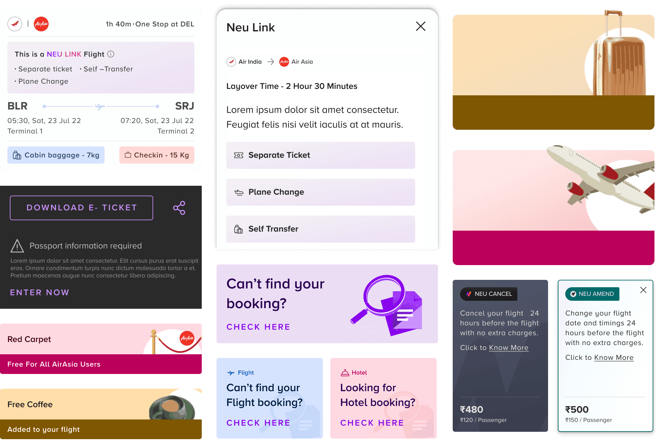
Shared Design System: It had to be ensured that developers had the correct Design System elements from the client In the latest Figma design
system we made
Streamlined Responsive Design: Providing Predefined image ratios within the design system facilitated quicker, more efficient
responsive layouts.
Proactive Asset Support: Sharing SVG’s (icons), Jason, etc. creating multi responsive
dimensions cards
Collaborative Edge Case Champions: Daily scrums fostered teamwork in identifying and solving potential edge cases (unforeseen design issues) before development.


Learning & Conclusion:
Working on the Tata Neu app was exhilarating. Knowing my design would shape travel experiences for millions across the globe fueled my motivation. I learned a lot, from mastering a complex design system to navigating stakeholder communication. There were challenges and occasional disappointments, but these experiences spurred my growth and professional development. Overall, it was a journey of creativity and personal satisfaction.
Working on the Tata Neu app was exhilarating. Knowing my design would shape travel experiences for millions across the globe fueled my motivation. I learned a lot, from mastering a complex design system to navigating stakeholder communication. There were challenges and occasional disappointments, but these experiences spurred my growth and professional development. Overall, it was a journey of creativity and personal satisfaction.
Working on the Tata Neu app was exhilarating. Knowing my design would shape travel experiences for millions across the globe fueled my motivation. I learned a lot, from mastering a complex design system to navigating stakeholder communication. There were challenges and occasional disappointments, but these experiences spurred my growth and professional development. Overall, it was a journey of creativity and personal satisfaction.
Design System Mastery: The Tata Neu project’s scale and complexity were fascinating. Navigating the intricate design system taught me to balance detail and cohesion.
Stakeholder Synergy: Explaining ideas to stakeholders felt like translating design into business outcomes. It was rewarding to see everyone grasp our vision.
Creative Collaboration: Team collaboration was fantastic. Using FigJam, we brainstormed and ideated like putting together a puzzle of user needs and solutions.
Intense Deadlines: Tight schedules made the project intense. Managing tasks and integrating Tata’s design system was like solving a complex puzzle under a ticking clock.
Innovative Ideas: We had great ideas like the smart calendar, though they didn’t make the first launch. This taught us to balance innovation with feasibility for future growth.ting multi responsive
dimensions cards
Collaborative Edge Case Champions: Daily scrums fostered teamwork in identifying and solving potential edge cases (unforeseen design issues) before development.
