Hyper Local Wellness Experience
HyperLocal Wellness Experience
Wellness Forever is a Simplified Hyper Local Experience while ordering Medication, Health & Fitness Products. Launched in 2008, this healthcare company simplifies medication and wellness shopping by combining 200+ stores with a user-friendly app. They offer convenient in-store pickup, home delivery, and expert advice from pharmacists, focusing on Western and Southern India. We were to completely redesign their current Online design experience.
Wellness Forever is a Simplified Hyper Local Experience while ordering Medication, Health & Fitness Products. Launched in 2008, this healthcare company simplifies medication and wellness shopping by combining 200+ stores with a user-friendly app. They offer convenient in-store pickup, home delivery, and expert advice from pharmacists, focusing on Western and Southern India. We were to completely redesign their current Online design experience.
E-Commerce
E-Commerce
Cross-Platform
Cross-Platform
Redesign
Redesign


08
08
08
Months
Joining a mobile redesign mid-stream, I tackled the responsive web version next. Simultaneously, I revamped app workflows and spearheaded a new micro-app launch for tier 2 & 3 cities.
Joining a mobile redesign mid-stream, I tackled the responsive web version next.
Simultaneously, I revamped app workflows and spearheaded a new micro-app launch for tier 2 & 3 cities.
Joining a mobile redesign mid-stream, I tackled the responsive web version next.
Simultaneously, I revamped app workflows and spearheaded a new micro-app launch for tier 2 & 3 cities.
MY ROLE
UX Analysis: I lead the charge on the web and PWA redesign. This involved analyzing business needs, user research, wireframing, prototyping, and refining everything with stakeholder feedback.
UI Design: Revamped the website's look and feel, then designed the all-new micro-franchise app from the ground up. Created illustrations, animations, icons, & UI elements to bring it all to life.
Production Support: I provided continuous support during production, implementing features, managing assets, and ensuring timely delivery by collaborating closely with the development team.
RESULTS
Mobile App Refresh: Revamped the existing mobile app experience.
Responsive Redesign: Delivered a fully responsive web version of the entire application that led to enhance online business.
Hyperlocal Delivery Innovation: Contributed to Conceptualized and designed a new hyperlocal delivery system with a focus on user experience and business requirements.
Micro-franchise App Launch: Led the design of a brand new app to launch their micro-franchise business wing.
PROJECT COLLABORATORS
Our Team : 1 UI/UX Designers(Myself),1 Project Manager, 1 Design Intern, 1 Design Head
Our Team : 1 UI/UX Designers(Myself),1 Project Manager, 1 Design Intern, 1 Design Head
Wellness(Client) Team : 1 Senior Product Manager, 1 Project Manager, UX design and Development Team along with
Board Stakeholders.
Wellness(Client) Team : 1 Senior Product Manager, 1 Project Manager, UX design and Development Team along with
Board Stakeholders.


Responsive PWA DESIGN
Responsive PWA DESIGN
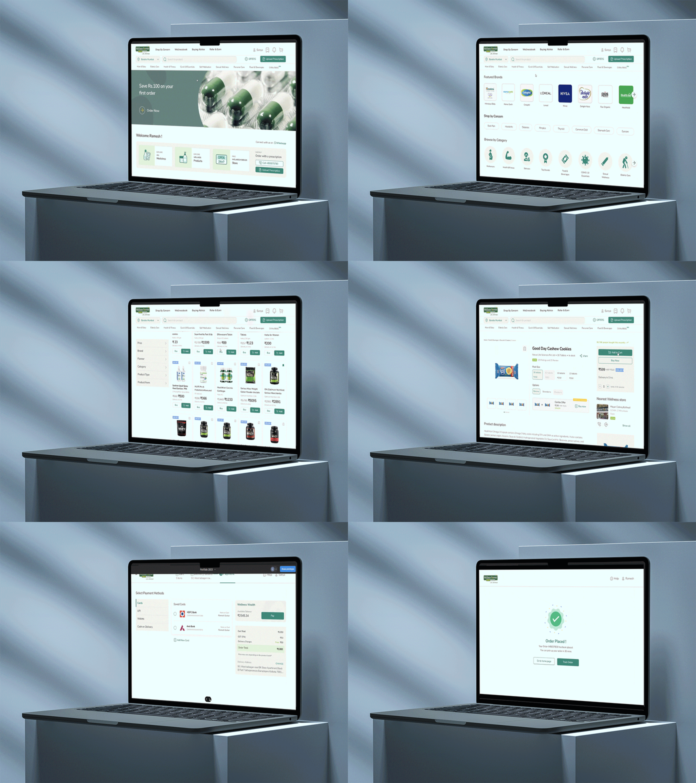
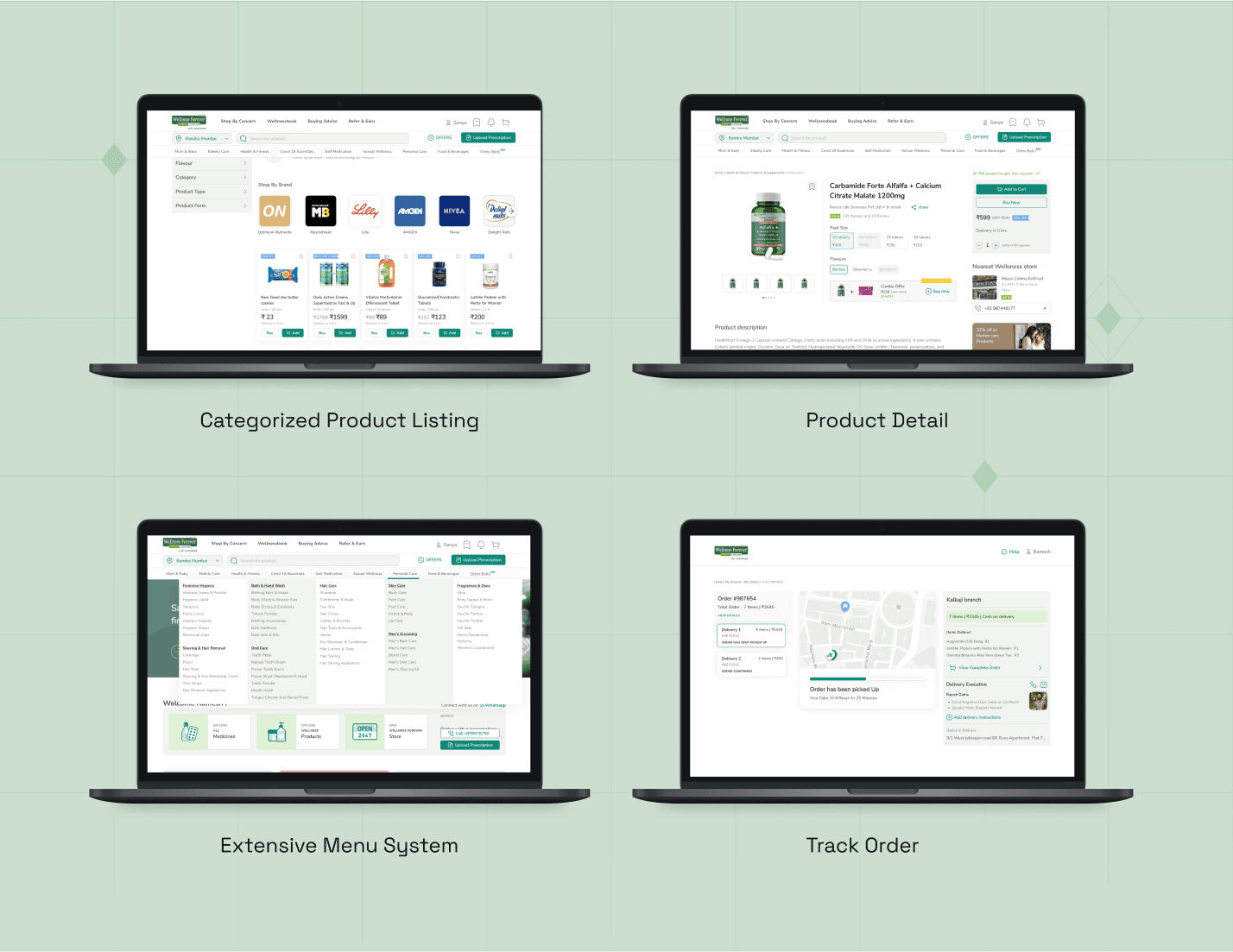
Translated the app's functionality into a web experience, including product browsing, purchasing, shipping tracking, and support.
Translated the app's functionality into a web experience, including product browsing, purchasing, shipping tracking, and support.
Translated the app's
functionality into a web experience, including product browsing, purchasing, shipping tracking, and support.
The Process
The Process
As my initial step towards website redesign, I examined the latest mobile experience workflow, building upon previous research findings.
As my initial step towards website redesign, I examined the latest mobile experience workflow, building upon previous research findings.
As my initial step towards website redesign, I examined the latest mobile experience workflow, building upon previous research findings.
Extensive competitive research was conducted. Pros and Cons were mapped to our user goals
Extensive competitive research was conducted. Pros and Cons were mapped to our user goals
Extensive competitive research was conducted. Pros and Cons were mapped to our user goals
Insights from user personas, journeys, and empathy maps guided user-centric design decisions, impacting the project's outcome.
Insights from user personas, journeys, and empathy maps guided user-centric design decisions, impacting the project's outcome.
Insights from user personas, journeys, and empathy maps guided user-centric design decisions, impacting the project's outcome.
Wireframes and prototypes were developed for user testing and stakeholder presentations.
Wireframes and prototypes were developed for user testing and stakeholder presentations.
Wireframes and prototypes were developed for user testing and stakeholder presentations.
Next, the complete visual design was implemented.
Next, the complete visual design was implemented.
Next, the complete visual design was implemented.




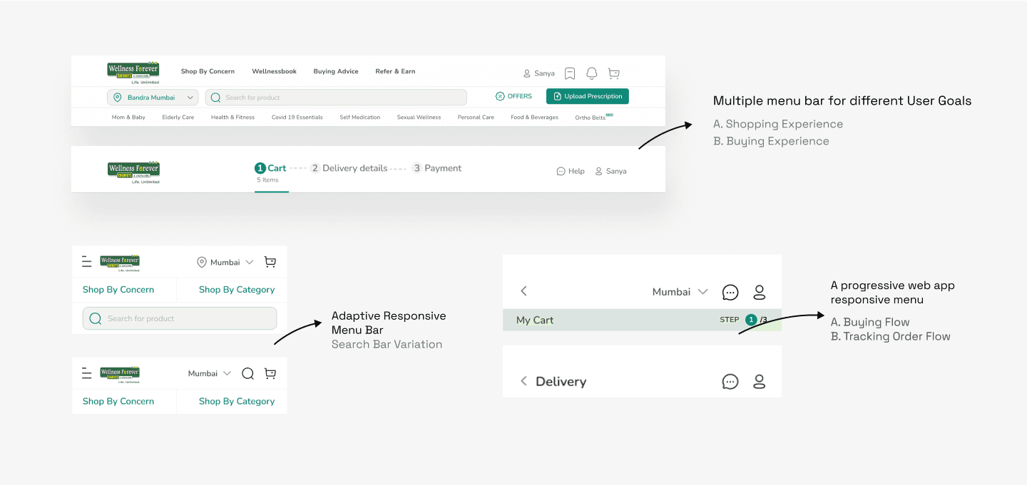
THE MENU BAR ADAPTABILITY
THE MENU BAR ADAPTABILITY
The responsive menu bar addressed diverse user requires, with multiple versions designed for specific usability and space considerations.
The responsive menu bar addressed diverse user requires, with multiple versions designed for specific usability and space considerations.
The responsive menu bar addressed diverse user requires, with multiple versions designed for specific usability and space considerations.


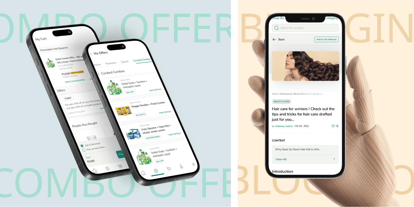
Enhancing The APP Experience
Enhancing The APP
Experience
I collaborated with the client's product lead, attending regular scrum meetings to align with business needs, create user scenarios, workflows, and prototypes, iterating based on feedback for deployment to Production Pipeline.
I collaborated with the client's product lead, attending regular scrum meetings to align with business needs, create user scenarios, workflows, and prototypes, iterating based on feedback for deployment to Production Pipeline.
I collaborated with the client's product lead, attending regular scrum meetings to align with business needs, create user scenarios, workflows, and prototypes, iterating based on feedback for deployment to Production Pipeline.
REWARDS PROGRAM
REWARDS PROGRAM
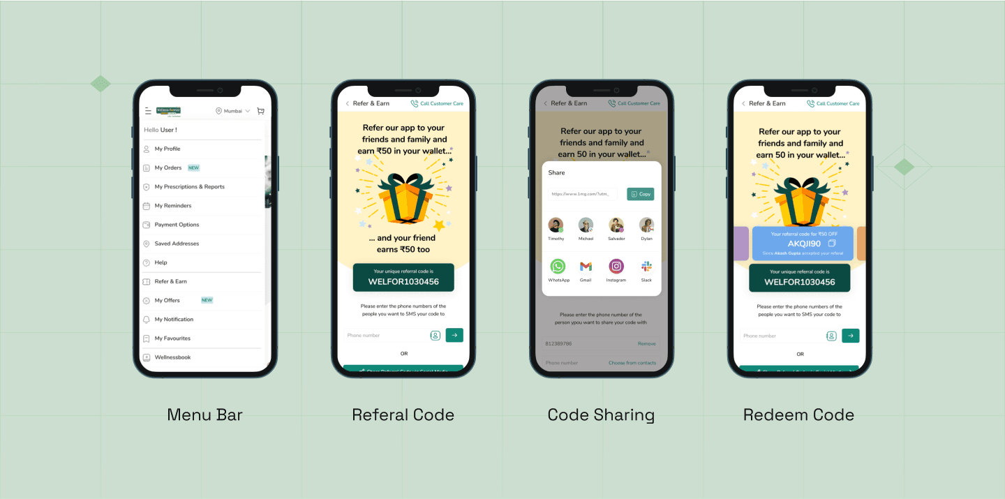
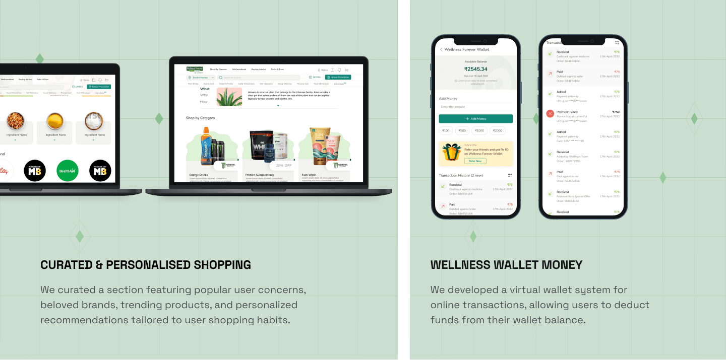
I designed a new referral rewards system, allowing users to earn discounts by referring the app to others.
I designed a new referral rewards system, allowing users to earn discounts by referring the app
to others.
I designed a new referral rewards system, allowing users to earn discounts by referring the app to others.


IMPROVED Prescription FLOW
IMPROVED Prescription
FLOW
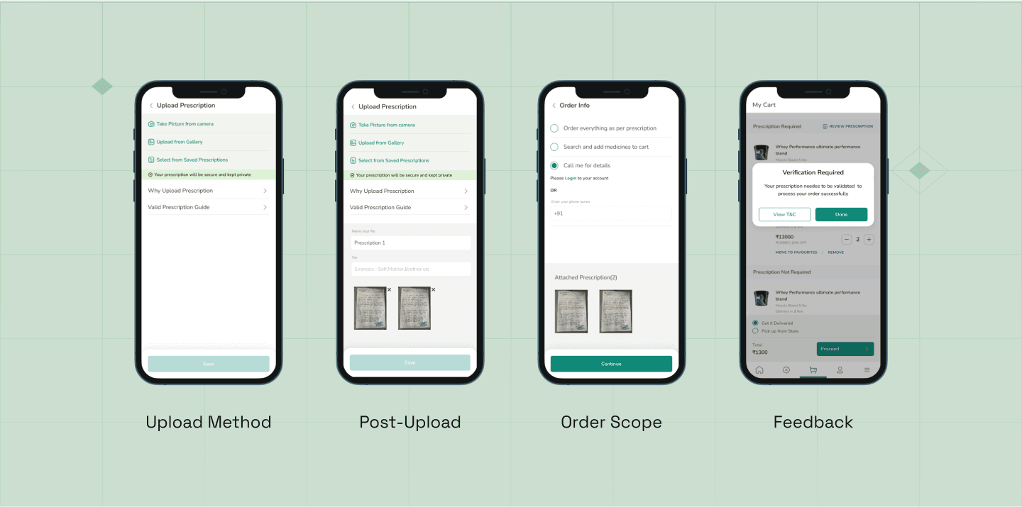
The existing prescription model underperformed in user testing, prompting an update. Drawing from competitive research, user testing data, and interviews, we improved the prescription flow.
The existing prescription mode
underperformed in user testing, prompting an update. Drawing from competitive research, user testing data, and interviews, we improved the prescription flow.
The existing prescription model underperformed in user testing, prompting an update. Drawing from competitive research, user testing data, and interviews, we improved the prescription flow.






ALL NEW MICRO-FRANCHISE APP
ALL NEW MICRO-
FRANCHISE APP
ALL NEW MICRO-FRANCHISE APP
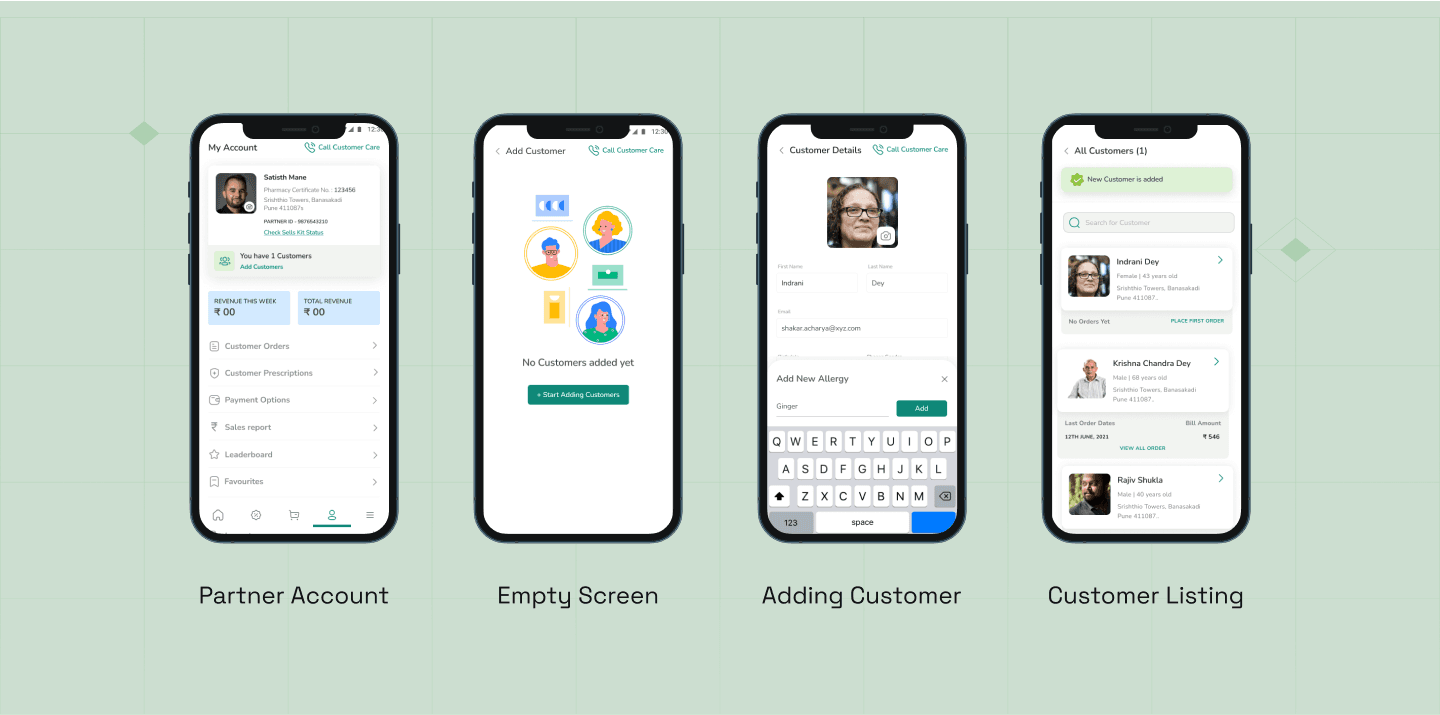
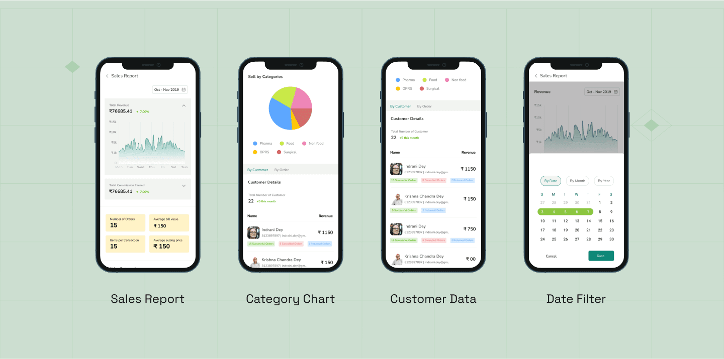
The company launched the "MICRO Franchise App" for Tier 2 and Tier 3 and cities & Town.
User signs up as our Franchise partners.
Partners then travel to understand medical needs, order medicines, and deliver them in their respective area. This service caters to areas lacking direct medicine orders
or smartphone access.
The company launched the "MICRO Franchise App" for Tier 2 and Tier 3 and cities & Town.
User signs up as our Franchise partners.
Partners then travel to understand medical needs, order medicines, and deliver them in their respective area. This service caters to areas lacking direct medicine orders or smartphone access.


UCD CANVAS
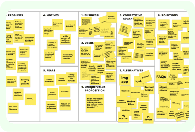
We collaborated with clients using the UCD canvas to outline basic requirements: motives, problems, fears, solutions, competitors, and unique selling points (USP's).
UCD CANVAS
We collaborated with clients using the UCD canvas to outline basic requirements: motives, problems, fears, solutions, competitors, and unique selling points (USP's).


USER PERSONA
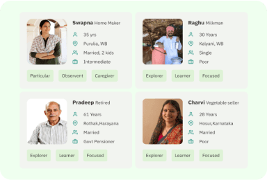
User personas were crafted specifically for Tier 2 and Tier 3 cities to gain deeper insights into user behavior and needs.
USER PERSONA
User personas were crafted specifically for Tier 2 and Tier 3 cities to gain deeper insights into user behavior and needs.


AFFINITY MAP
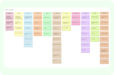
Affinity mapping helped cluster the user journey and modules into categories, clarifying the flow further.
AFFINITY MAP
Affinity mapping helped cluster the user journey and modules into categories, clarifying the flow further.
AFFINITY MAP
Affinity mapping helped cluster the user journey and modules into categories, clarifying the flow further.
Competitive RESEARCH
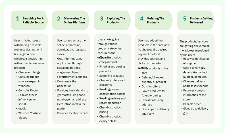
A user journey map was developed to comprehend the fundamental user flow.
A user journey map was developed to comprehend the fundamental user flow.
Competitive RESEARCH
A user journey map was developed to comprehend the fundamental user flow.


USER FLOW
User flow diagrams were created to
solidify the research process before
transitioning to wireframes.
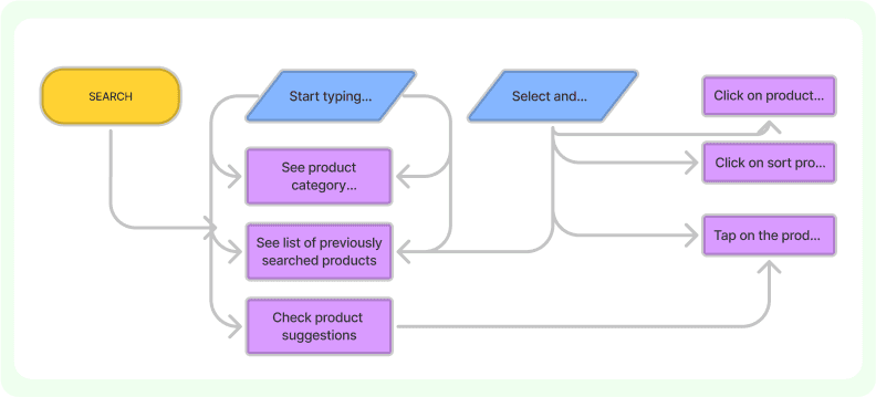
User flow diagrams were created to solidify the research process before
transitioning to wireframes.
USER FLOW
User flow diagrams were created to
solidify the research process before
transitioning to wireframes.


wIREFRAMe
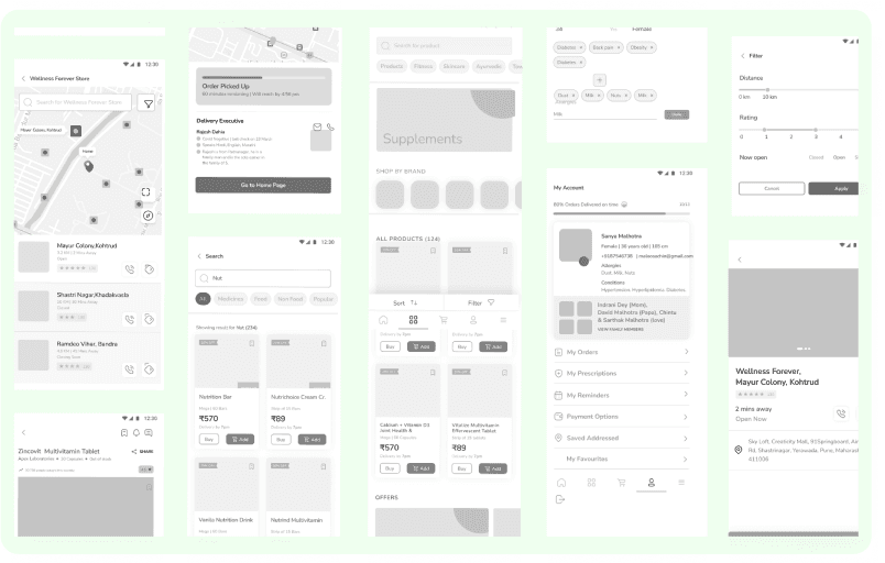
We translated these insights and
workflows into low-fidelity wireframes
to map out the screens and user journey.
Using interview data, user research, and our subject expertise, we pinpointed what users are truly
looking for.
wIREFRAMe
Using interview data, user research, and
our subject expertise, we pinpointed what users are truly looking for.


visual design
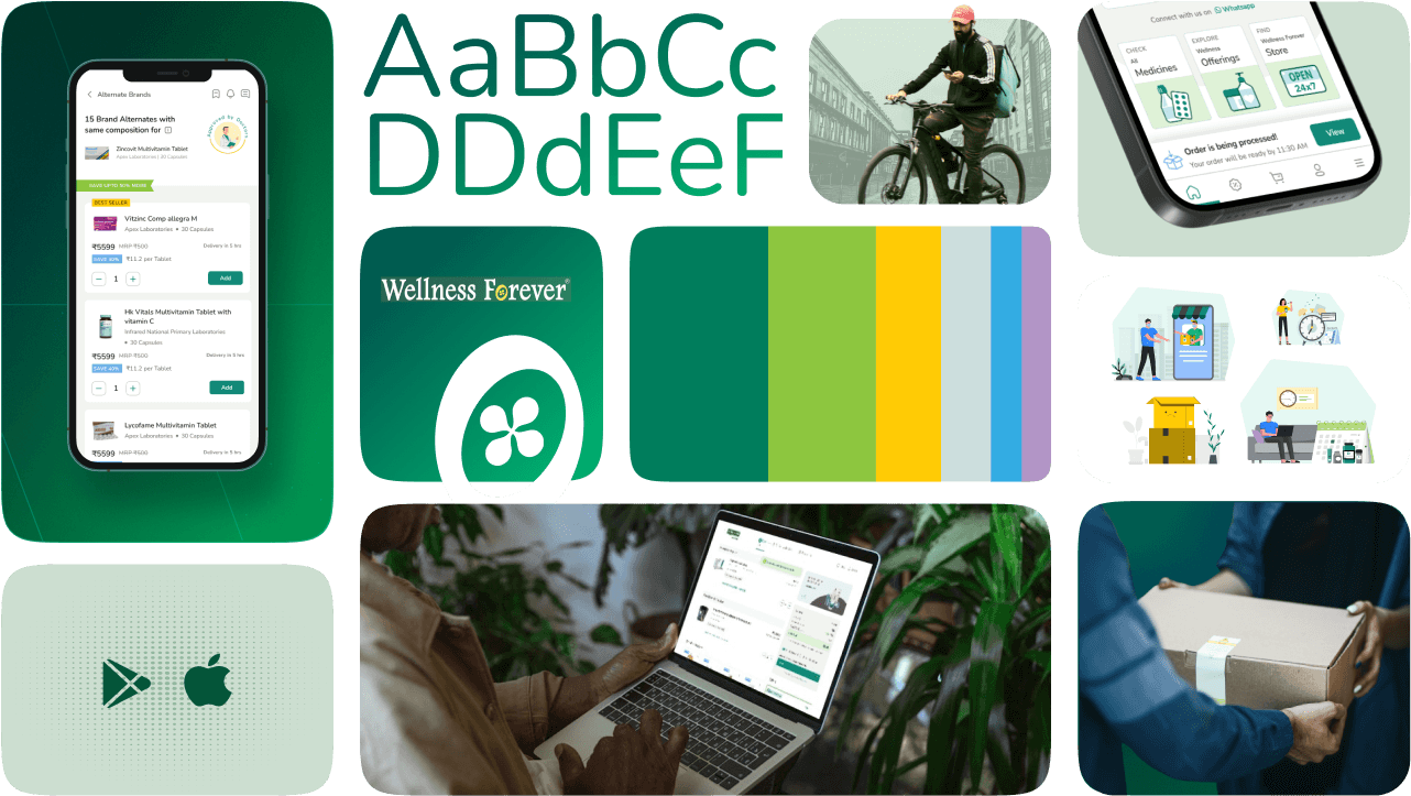
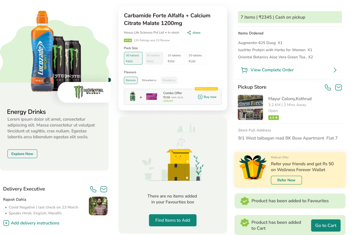
We utilized the visual language of the parent app for online shopping, enhancing the design system with unique card styles, colors, and UI interactions tailored to our needs.
We utilized the visual language of the parent app for online shopping, enhancing the design system with unique card styles, colors, and UI interactions tailored to our needs.
We utilized the visual language of the parent app for online shopping, enhancing the design system with unique card styles, colors, and UI interactions tailored to our needs.




Dev Production Support:
Daily scrums became the cornerstone of seamless development, fostering close collaboration between UI/UX design, Design Managers and development teams.
Daily scrums became the cornerstone of seamless development, fostering close collaboration between UI/UX design, Design Managers and development teams.
Daily scrums became the cornerstone of seamless development, fostering close collaboration between UI/UX design, Design Managers and development teams.
Proactive Asset Support: Sharing SVGs (icons),jasons,and varios files
Agile Adaptation: Addressed immediate and missing requirements, such as empty spaces, new modules, and icon changes, dynamically throughout the process.
Collaborative Edge Case Champions: Daily scrums fostered teamwork in identifying and solving potential edge cases (unforeseen design issues) before development.


Learning & Conclusion:
I was excited and nervous to join the Wellness Forever project, expecting a straightforward mobile-to-desktop transition. The complexity of designing for larger screens surprised me, but I learned a lot about layout, information hierarchy, and adaptability. I also improved my Figma skills by lear and gained insights into e-commerce.
I was excited and nervous to join the Wellness Forever project, expecting a straightforward mobile-to-desktop transition. The complexity of designing for larger screens surprised me, but I learned a lot about layout, information hierarchy, and adaptability. I also improved my Figma skills by lear and gained insights into e-commerce.
I was excited and nervous to join the Wellness Forever project, expecting a straightforward mobile-to-desktop transition. The complexity of designing for larger screens surprised me, but I learned a lot about layout, information hierarchy, and adaptability. I also improved my Figma skills by lear and gained insights into e-commerce.
Adapting to Larger Screens: Transitioning the mobile app to PWA desktop was complex, teaching me about layout, hierarchy, and adaptability for larger spaces.
Figma Proficiency: Strengthened skills in Figma, mastering components, design systems, auto layout, and other essential techniques.
E-commerce Insights: Gained a deep understanding of e-commerce operations and requirements, aligning design with business objectives and user needs.
File Management Lesson:
Made an error by referring to an outdated document instead of the updated one, learning the crucial importance of proper file management.
Overcoming Challenges: Faced tight deadlines and integrated detailed design systems, learning the importance of flexibility and resilience in design.
Adapting to Responsiveness: Transitioning the mobile app to PWA desktop was complex, teaching me about layout, hierarchy, and adaptability for larger spaces.
Figma Proficiency: Strengthened skills in Figma, mastering components, design systems, auto layout, and other essential techniques.
E-commerce Insights: Gained a deep understanding of e-commerce operations and requirements, aligning design with business objectives and user needs.
File Management Lesson:
Made an error by referring to an outdated document instead of the updated one, learning the crucial importance of proper file management.
Overcoming Challenges: Faced tight deadlines and integrated detailed design systems, learning the importance of flexibility and resilience in design.
Adapting to Larger Screens: Transitioning the mobile app to PWA desktop was complex, teaching me about layout, hierarchy, and adaptability for larger spaces.
Figma Proficiency: Strengthened skills in Figma, mastering components, design systems, auto layout, and other essential techniques.
E-commerce Insights: Gained a deep understanding of e-commerce operations and requirements, aligning design with business objectives and user needs.
File Management Lesson:
Made an error by referring to an outdated document instead of the updated one, learning the crucial importance of proper file management.
Overcoming Challenges: Faced tight deadlines and integrated detailed design systems, learning the importance of flexibility and resilience in design.
